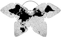
Cahill 1909
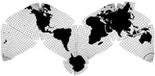
Cahill-Keyes 1975
|
Cahill 1909
|
Go back to
Gene Keyes home page
Cahill-Keyes 1975 |
|
Why Cahill? What about Buckminster Fuller?
Evolution of the Dymaxion Map: An Illustrated Tour and Critique Part 7 by Gene Keyes 2009-06-15 Summary: I
love Bucky, but Cahill's map is a lot better. Here's how.
CONTENTS Click inside boxes to open other sections in separate windows. |
|
Part 7
1995 ff: Dymaxion Maps on the Internet Nowadays one can go to Google Images and fish
out various Dymaxion maps of various types and sizes. Chris Rywalt
in 1995 made a classic unfolding-animation of the icosahedron, and released
it into the public domain. Here is his page of description and source
codes: http://www.westnet.com/%7Ecrywalt/unfold.html, updated
in 2003.
The animation is easily available at Wikipedia, so below I am showing some stills. While the animation itself is a fine piece of work; my objection is that it makes the icosahedral map look a lot simpler and more accurate than it really is in relation to a globe. I argue in Parts 8 and 9, that a Fuller map is much less comparable to a globe than a Cahill map. Cahill very evenly and vividly divides the world with 3 strokes: Equator, and two meridians: eight pieces. He was able to demonstrate the principle with a rubber ball painted as a globe, and cut along enough of the incisions to squeeze it flat under a piece of glass; the ball would return to its globe shape once the glass was removed. However, the icosahedron and its equivalent globe offer no such physical and visual transformation. Worse yet, Fuller's icosahedron does not comport with a globe's meridians and parallels — the graticule. Rywalt's animation has done an excellent job as a virtual and graphical illustration of a Dymaxion map going from globe to icosahedron to flat map, but it is not a hands-on physical object. Furthermore, it does not show the graticule, and not even the triangles' dividing lines. In reality, there is no pre-icosahedral earth-globe. And if there was one, it could not match the elegance and simplicity of either Cahill's ball, or a real globe with bold-ehancement of Cahill's 3 dividing lines. I should know, and here's why: Before switching to
Cahill, I had taken a 12" globe, drawn a 5º graticule on it,
inserted map pins in Fuller's 20 vertex points, and then strung red
yarn to demarcate a spherical icosahron a la Fuller's layout. The result
is a very cluttered and off-center artifact. (See pictures in
Part 9.7-a.)
We all can see that a geodesic dome — descendent of the Dymaxion map — is a thing of beauty. But it is also intricate, and ever more so as the frequency of the grid increases. I, for one, can admire a geodesic dome — like the famous one I visited in Montreal — but I cannot sort out its polygons by eye. Likewise, a spherical icosahedron laid on a terrestrial globe is a complex and confusing affair, compared to an octahedral overlay. as well as compared to a global graticule. In a Cahill map, each octant preserves and replicates an identical graticule, as seen on a globe, and as seen laid out flat. The octants' poles are at one end; the Equator at the other. The parallels and meridians are in complete alignment with the boundaries of the octant. Not so a Fuller icosahedral. The parallels and meridians clash in every way with the edges of every triangle. Fuller's great-circle gridwork is quite a different structure than a globe's lines of latitude and longitude. It is gorgeous on a geodesic bulding; it is something else again on a globe. My point is, that the Dymaxion map animation looks great, but it is from a distance, and it omits the graticule. It is like beautiful pictures on a food package that do not live up to the contents. If the same animation were done to a Cahill-type map, it could include the graticule, at any degree of closeness, and a smooth unrolling would be apparent, rather than the crazy-quilt degeneration suffered by the asymmetrical Dymaxion and its asymmetrical graticule, but not visible here. Having said that, I still enjoy watching Rywalt's animation do its thing. |
|
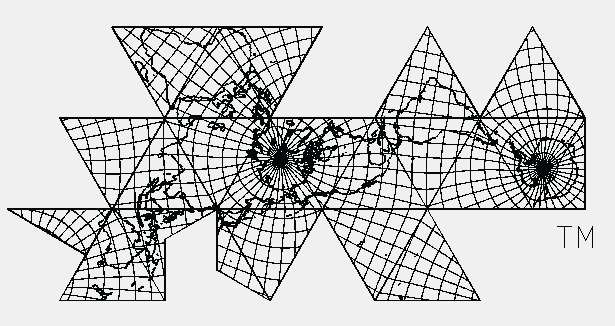
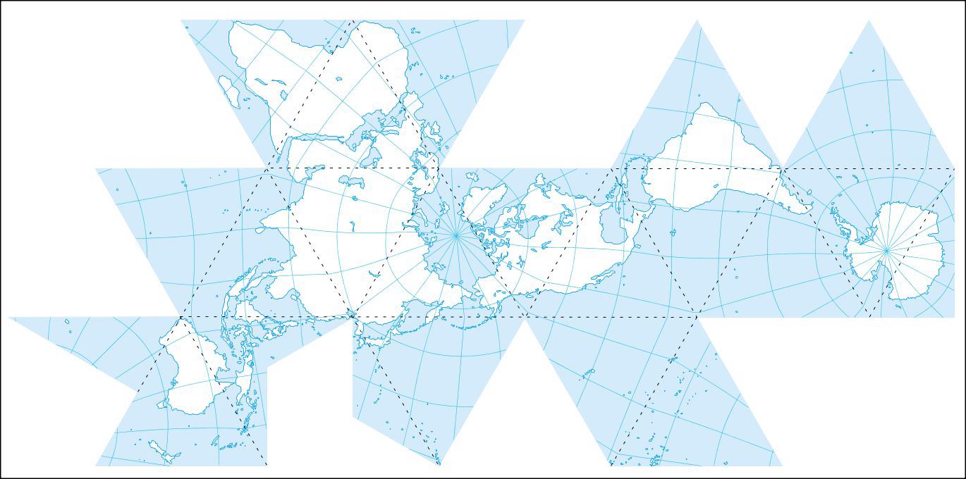
Fig. 7.1-8 below: Stills from Chris Rywalt's
"Dymaxion Projection Animation". (His png's are about 800 kb a pop;
my converted jpegs below at the same size use 20 times fewer kb: about
40 kb each. I have added "r" suffix to original file names to indicate
my rotation of frames to a "customary" orientation of Antarctica on the
right. Source note after Fig. 7.8.)
|
|
Fig. 7.1: dymax000r.jpg
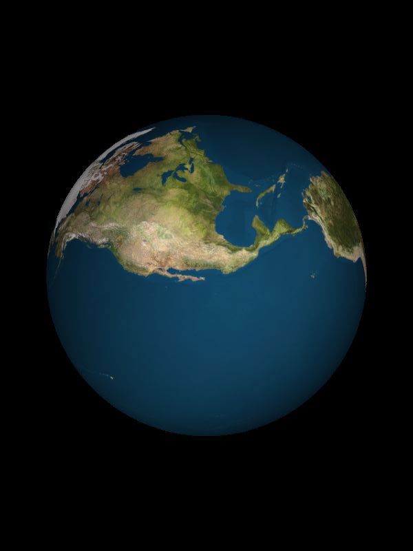
Fig. 7.2: dymax010r.jpg
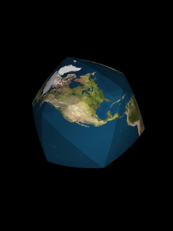
Fig. 7.3: dymax020r.jpg
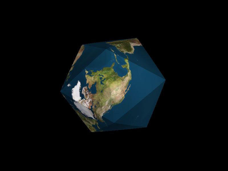
Fig. 7.4: dymax040r.jpg
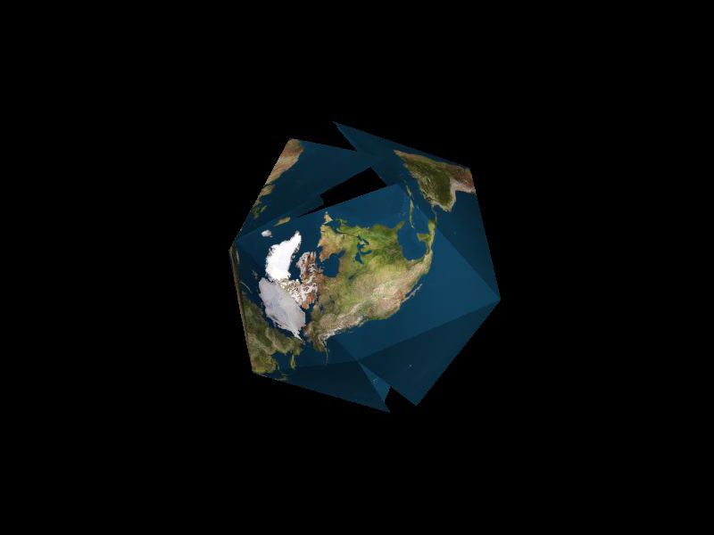
Fig. 7.5: dymax055r.jpg
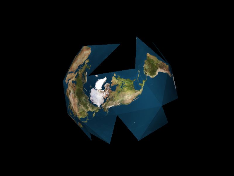
Fig. 7.6: dymax065r.jpg
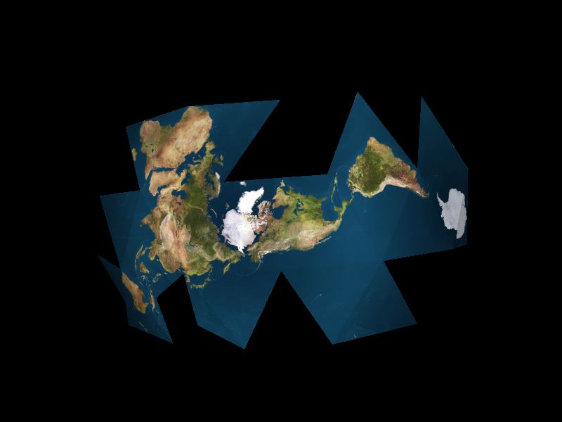
Fig. 7.7: dymax070r.jpg
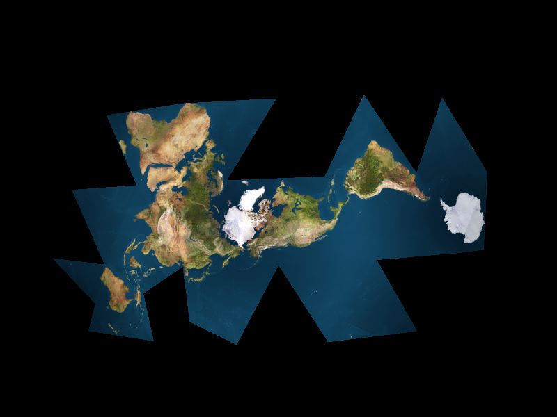
Fig. 7.8: dymax077r.jpg
Source: stills dated 2003-01-29 from http://www.westnet.com/%7Ecrywalt/unfold.html "a ZIPfile of all the resulting [77] PNGs at 800x600" selected and reoriented by Gene Keyes. Copyleft © 1995 Christopher Rywalt |
|
Here are some other Dymaxion map Internet specimens,
from smaller to larger. Scales calcuated by GK according to their triangle
edge lengths in mm on my 19" Mac monitor. Your millimeterage
may vary, so make allowances. (See Part 8, Notes on Scaling Dymaxion Maps.)
|
|
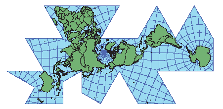
Fig. 7.9 below: Re-focusing on geocell size:
many Fuller maps have no grid at all, e.g., Rywalt’s above. Most others have,
at best, the undesirable 15x15º graticlue (except Grip-Kitrick; see
Critique,
Part 9.2). One other exception is this outline map by Robert W.
Gray, with a 10x10º gratricule — still not up to the minimum 5x5º
standard I emphasize throughout my presentation, for showing whether or
not a world map is faithful to a globe. Gray's triangle edge length
is 38.8 mm for a scale of 1/181,000,000.
|
Source: Robert W. Gray's Fuller Notes
http://www.rwgrayprojects.com/rbfnotes/maps/graymap2.html |
|
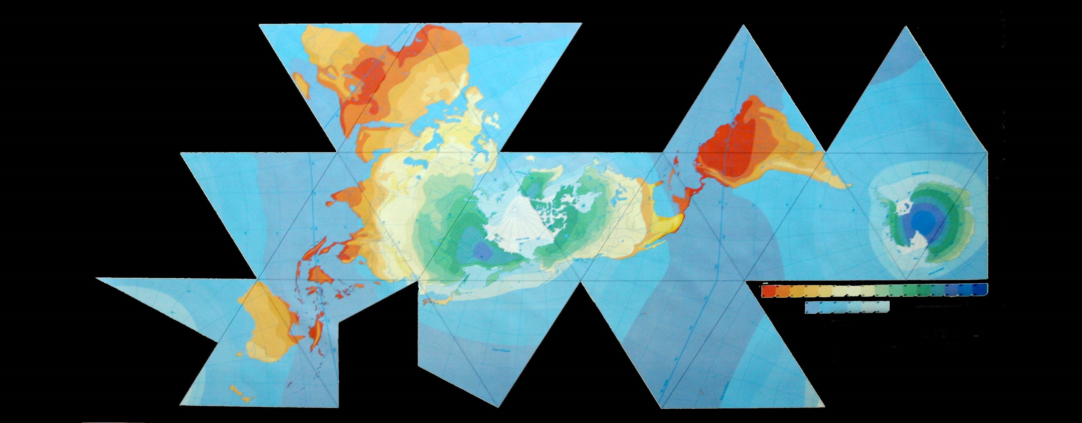
Fig. 7.10 below: A typical 15º
graticule, but not on the land areas. Besides Fuller's original 1943 version
in Life, perhaps the only Dymaxion maps with national boundaries
are from the ESRI website. The first one here has a 28 mm edge lengths,
for a scale of 1/252,000,000. (Internal triangle edges missing.)
|
Source:
http://webhelp.esri.com/arcgisdesktop/9.2/published_images/fuller2.gif |
|
Fig. 7.11 below: Another ESRI map with boundaries,
and among the largest Fuller icosahedrals on the Net. This one has yet wider
geocells than Fig. 7.9 above, 20x20º, except 20x30º at the
poles. Triangle edge length 89.6 mm, for a scale of 1/78,000,000. (Internal
triangle edges missing.)
|
|
For a smaller picture size, click in it
once; to restore full size, click in it twice.
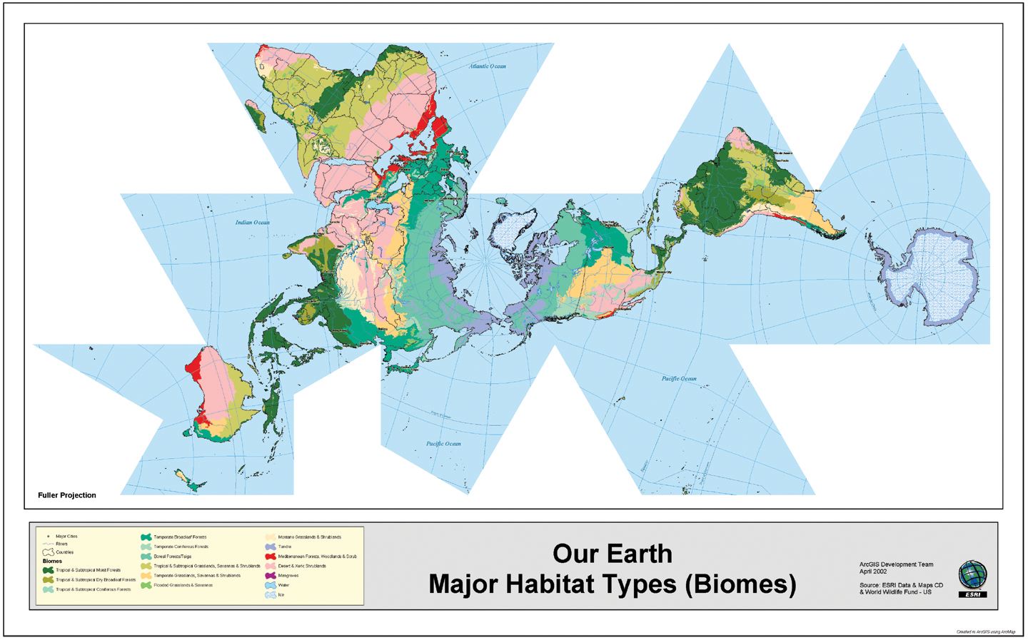
Source: http://www.esri.com/news/arcnews/summer03articles/summer03gifs/p7p4-lg.jpg 716 kb image de-bloated by Gene Keyes to 172 kb and same dimensions as original. |
|
Fig. 7.12 below: Eric Gaba's rendition
for Wikipedia's "Dymaxion Projection" article has the internal triangle
lines, but again, like Fig. 7.11 above, a wide-stance graticule of
20x20º, except 20x30º at the poles. Triangle length is 89.5 mm,
for a scale of 1/78,000,000.
|
|
For a smaller picture size, click in it
once; to restore full size, click in it twice.
Source: Eric Gaba, http://en.wikipedia.org/wiki/File%3AFuller_projection.svg 628 kb svg image de-bloated and converted to 124 kb jpg at same dimensions by Gene Keyes. |
|
Fig. 7.13 below: Here is the largest Dymaxion
map on the Internet. The Web has several different composite satellite-image
icosahedrals, but this one lacks sourcing and so far I haven't been
able to ID it from its looks. (Cf. Rywalt set above. Figs. 7.1-8.)
Triangle edge lengthis 137 mm; therefore scale is 1/51,000,000.
|
|
For a smaller picture size, click in it
once; to restore full size, click in it twice.
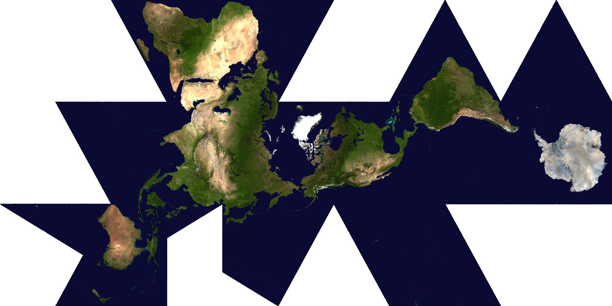
Source: http://mappinghacks.com/maps/dymaxion.png De-bloated from 873 kb png to 144 kb jpg at same dimensions by Gene Keyes |
|
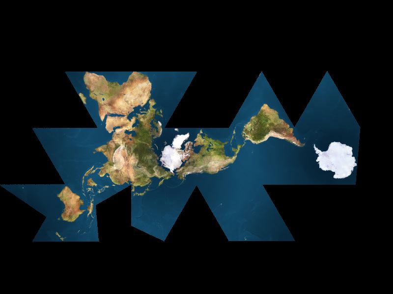
Fig. 7.14 below: Well, technically, the
next image is bigger than Fig. 7.13 above, but it seems to
me blurred and at least twice its intended size.. This is the Earth
Voyage "Big Map" of 1/2.000.000 seen in floor pictures in Part 6, Figs. 6.14 and
6.15. As shown on the Web, and here, the picture has edge lengths of
137 mm, and a scale of 1/36,000,000.
|
|
For a smaller picture size, click in it
once; to restore full size, click in it twice.
Source: http://earthvoyage.googlepages.com/map.jpg/map-full;effect:autolevels,100.jpg |
|
Throughout this presentation, I have spoken of
the various maps' respective scales, and my enlarging or reducing of them
to a desired RF (Representative Fraction, e.g., 1/100,000,000.) Determing
scales on Dymaxion maps is not at all straightforward, and made all the
more difficult by their aversion to the metric system. The next part describes
how I sussed out their scales.
|