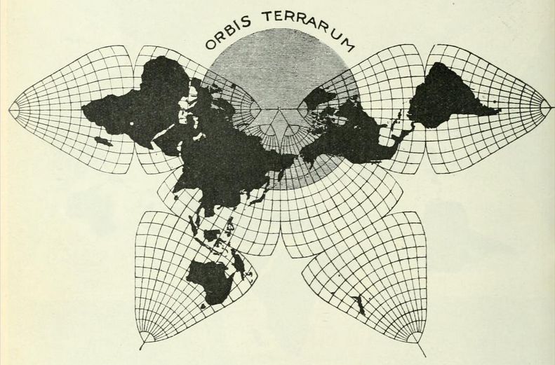
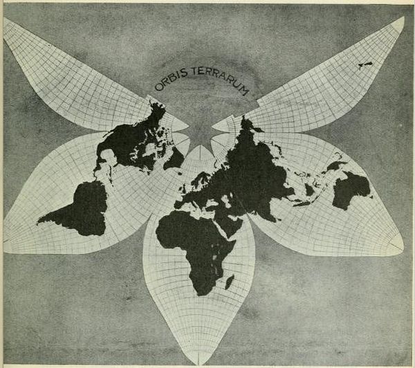
B.J.S. Cahill's original Butterfly Map, 1909, p. 464 below (enlarged by GK).
|
B.J.S. Cahill, "An Account
of a New Land Map of the World"
(The Scottish Geographical Magazine, 1909-09) p. 449-469 Illustrated article, scanned and reformatted in HTML by Gene Keyes. |
|
B.J.S. Cahill's original Butterfly Map, 1909, p. 464 below (enlarged by GK). |
|
Presentation notes by Gene Keyes
2007-04-17 first reprint edition (jpegs) 2011-12-08 second reprint edition (HTML) 2013-02-01 third reprint edition (HTML, with much better images) 1) This is Cahill's first publication and exposition of the Butterfly World Map, in 1909. (It did not acquire that permanent nickname until three years later.) 2) I had Xeroxed the article in June 1973 from The Scottish Geographical Magazine (at the Southern Illinois University library, Carbondale). In those days, Xerox could not do a solid black. Therefore, the map-illustration continents, vivid silhouettes in the original, were badly washed out in the photocopies and their scans. 3) When I first reprinted this article on my website in 2007-04, I simply made jpegs of each old Xerox page, fearing that they were not good enough for OCR (optical character recognition). However, I got better at it, and then did a second reprint in 2011, a full-fledged OCR to HTML version. 4) The map images in my 2007 jpeg reprint had suffered from the faint black of primitive Xerox. For the second version, in HTML, I scanned better examples of the same pictures, from alternate prints or articles. Most were still unsatisfactory, including Cahill's original Butterfly map (above, and p. 464). I attempted two different composites from similar sources. My first reprint's version was murky. The second reprint was a brighter white, but I had to omit the grey "Orbis Terarrum" disk, leaving only a semi-circle. (See appendix at end.) 5) I now exhibit a full copy of the original original — in fact, quite a bit bigger than it appeared in the magazine. How? Previously here I had stated, "If someone could send me new photocopies or scans of the pictures in this article, in full, crisp black and white, that would be a blessing." 6) Well, indeed, — 40 years since my first imperfect Xerox — I heard from Enrico Spinielli, who told me that The Internet Archive had recently put up free searchable scans of this and other pieces by Cahill (to say nothing of so much else). The URL is: http://archive.org/stream/scottishgeograph25scotuoft#page/n483/mode/2up 7) I have used some images from that to supplant the imperfect ones in my second reprint. Downloading those images resulted in larger versions than the magazine's actual prints — which were smaller than Cahill's artwork anyway — so I was happy to insert a number of oversize illustrations here. And I salute The Internet Archive for acting as a true public fountain of information, unlike JSTOR, whose paywall practices led to the persecution and suicide of Internet genius Aaron Swartz. 8) While now you can read the piece in its actual magazine appearance — and slightly yellowing pages — at the above link, I am keeping my own OCR rendition here in the Cahill Resource because this article is the lodestone, the original, of the Cahill world map. Also, because my reprint is easier to read, and that I took the liberty of enlarging some of the images, as above. But if you need a hard copy, try that link. (gene.keyes at gmail dot com)
|
|
[1909-09]
[p.449]
THE SCOTTISH GEOGRAPHICAL MAGAZINE AN ACCOUNT OF A NEW LAND MAP OF THE WORLD By BERNARD J. S. CAHILL,
Associate American Institute of Architects.
(With Maps and Diagrams.)
IF some one should suggest that it was about time to rearrange the letters of the alphabet — to begin, let us say, with the letter "E," followed by the vowels in the order of their use, then the gutturals, labials, dcntals, and sibilants, and so on until we ended with the aspirate — he could hardly be guilty of a more repugnant innovation in the eyes of most men, than if he proposed a new map of the world to supplant Mercator's. But while nothing much is to be gained by adopting a more logical alphabet, there is very much to be gained by inventing and adopting a more accurate projection of the world than Mercator's. Mercator's chart is comparatively a very recent achieyement. It was published in 1569, and is therefore just 340 years old this year. In its day its appearance marked an epoch in the history and practice of navigation. It was, in fact, the most useful device next to the compass for guiding mariners on the high seas. Navigation became, at once, comparatively safe and simple. The rectilinear co-ordinates of Mercator's chart, wherein degrees of latitude "are enlarged towards both poles in the same proportion that they hold in their relation to the equator," became the fixed type for all maps in use among mariners thirty years thereafter, and such it has remained ever since. The title of Mercator's chart as originally published reads "Nova et auchta orbis terrae descriptio ad usum navigantium emendate accommodata" — in other words, a new and enlarged delineation of the world adapted for the use of navigators. VOL. XXV. |
| 450 SCOTTISH GEOGRAPHICAL MAGAZINE Too much stress cannot be laid on Gerhard Kremer's deliberate dedication of his immortal map, ad usum navigantium.
In other words, Mercator himself and all other navigators and geographers were well aware that this chart was merely an instrument to lay out the boundary coasts of oceans in such a way that oblique and curved courses from place to place (on a globe) could be reduced to straight lines, and so worked out with log and compass. This necessitated gross exaggeration of the actual outlines of the earth as one recedes from the equator. But in speaking of charts for navigators, it is perhaps wrong to speak of the shape of the earth; it is the shape of the oceans that concerns the navigator. In other words, the world can be regarded from two quite different view points. A mariner at sea has no interest in the land or the shape of the land, other than as it confines the oceans. For purposes of steam navigation, in which for directness of route and economy of fuel all courses should be arcs of great circles, there are now in use charts of the ocean on a gnomonic projection in which all straight lines are parts of great circles, and consequently straight lines drawn from one port to another constitute the correct course for a ship . to take for economy and speed. The outlines of the continents bounding such an oceanic chart are in places absolutely unrecognisable. In other words, the better adapted a map is for a seaman's purposes, the less use is it for a landsman's. "For other purposes than those of navigation, a Mercator's chart is likely to be extremely misleading," says Captain Lecky in his Wrinkles on Practical Navigation; and further on he characterises Mercator's map as "an extraordinary production when compared with the globe as we know it." It would hardly be necessary to say much of the gross exaggerations of Mercator's projection to a body of professional geographers, still less would it be necessary if Mercator's projection were used only for those purposes for which it was intended. But it has come into such general unchallenged use for all purposes, that its utter unsuitableness for most of them cannot be pointed out with too much emphasis. This map fails entirely to give one a true comparative notion either of absolute land masses or of the relation of one part of the world to another. Thus the mainland of Canada appears on Mercator's map to be about twice the size, and Alaska half the size of the United States. The Russian Empire entirely overwhelms the empires of Ohina and India. In fact, the whole of Northern Asia is so monstrously exaggerated that the bulks of Africa and South America seem almost insignificant in comparison. Moreover, while the islands of Ceylon and the Eastern Archipelago appear very nearly in their true dimensions, the New Zealand Islands are magnified just twice, and the British Islands about four times, the area they should be on the same scale. Norway and Sweden show at least ten times their true size, while the climax is reached in Greenland, which looms up as a huge continent considerably bigger than South America and about as big as the whole of Africa! |
|
AN ACCOUNT OF A NEW LAND MAP OF THE WORLD 451
Finally, the limit of absurdity is reached
at the Pole. If the actual Pole were on an islet a mile wide, it would have
to appear as wide as the equator — that is, four and twenty thousand miles across, instead of a mile.
|
|
| Figs. 1 and
2 — Mercator's Chart below, and the "gores" of a globe above, both to the
same scale (at the horizon). The excess of black in 1 is the exact extent
of the error. |
| 452 SCOTTISH GEOGRAPHICAL MAGAZINE Now on turning to a globe, or to the gores that to to make a globe, arranged
side by side and to the same scale as the Mercator map (Figures 1 and 2),
we learn the exact truth, and can see at a glance that Canada is about equal
to and not twice the size of the United States; while Alaska is not half
but about one-fifth of either of them. The Russian Empire is seen to be only
about one third larger than India and China combined. African and South America
loom up on the globe vastly more dominant than one would possibly gather
from Mercator's chart, while Greenland, that seemed to peer either of them,
is now hardly noticeable.
And if the land masses on Mercator's map are entirely falsified, so of course are distances by sea. On Mercator's map the route from East to West along the 60th parallel, between Norway and Labrador, appears to be about the same in length as from East to West along the 20th parallel, from the west of Africa to Yucatan in Mexico. On a globe (or on the gores of of a globe) the distance of the southern trip is just twice the northern one.— over 2000 miles in the one case, and under 4000 in the other. In other words, an attempt to compare an imaginary steamship route in the North Atlantic with one in mid-Atlantic will lead one astray to the extent of 2000 miles — an error of 100 per cent. Besides these enormous exaggerations Mercator's chart of the world actually fails to indicate or visualise in any way the rotundity of the earth and the consequent convergence of the continents at the poles. Furthermore, Mercator's chart not only exaggerates, but it distorts the forms of the continents. This is not usually admitted, because it is contended that as we go North and South from the Equator, keeping the meridians of Longitude parallel instead of converging them, we also draw out the parallels of Latitude correspondingly. This is equivalent |
|
AN ACCOUNT OF A NEW LAND MAP OF THE WORLD 453
to enlarging the scale of the human figure from
the feet up to the head. It is true that the feet are correct, and the knees,
the trunk, the torso, and the head may all be approximatcly in right proportion,
but as each zone is on a larger scale than the one below it, the entire figure
is not merely an exaggeration but a distortion.
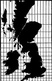
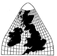
On Mercator's projection the British Isles are exaggerated as a group — quadrupled in area, in fact, but the distortion is not so noticeable between Cornwall and Caithness because the convergence is slight absolutely, and is hardly discernible on a map showing the whole world. But let us suppose, those of us especially who are familiar from childhood with the map of the British Isles, that we were born on a continent like North America. Let us suppose that the British Isles, like the continent of North America, reached from the Equator to the Arctic Circle and above — as far as eighty degrees North latitude, let us say. Figure 4 shows the true shape and size of our imaginary realm, Cornwall touching the Equator, and Caithness reaching eighty degrees North. Eigure 3 shows our expanded realm drawn on Mercator's projection. Here we have both exaggeration in the case of Scotland, and distortion in the case of Great Britain.
Where artists draw portraits of well-known public characters with enormous heads and shoulders on, diminishing trunks and almost invisible feet, we have most of the elements that go to make a caricature Figure 3 is surely a caricature of the British Isles. In like manner, North America is caricatured on eyery map drawn to Mercator's projection. South America is also distorted on Mercator's projection. The lower part is dragged down and thickened in appearance until the most beautiful of all the continents is deprived of much of its symmetry and elegance. So far, we have spoken of Mercator's distortions and exaggerations, with a brief reference to a gnomonic sea chart, but there are other projections rather popular among geographers and projection experts — the so-called equal-area maps. They are not in very general use. Just what elements of use, fitness, and truth ensure permanence to a map projection, it is not easy to define, but one might be inclined to argue that exaggeration is preferable to distortion. But if we must have distortion, rectilinear or symmetrical distortion — that is, distortion upon an axis — is preferable to oblique or curvilinear distortion. This is in agreement with |
| 454 SCOTTISH GEOGRAPHICAL MAGAZINE our ineradicable instinct for symmetry, which
doubtless comes of the pervading presence of symmetry throughout Nature in
astronomic, crystalline and organic forms.
Here, for example, is the shape of Australia on a world map, projected on an equal-area basis (Figure 5). It is a scientific map, yet it would never be as acceptable as a map that showed the island continent about as the average man remembers it — that is to say, not noticeably distorted. Other purely circular projections, such as Mollweide's, Van der Grinten's, and thc polyconic types, show distortions far more violent than this, and therefore they stand a chance of being instinctively rejected. Men have the purely scientific spirit only occasionally and by effort. 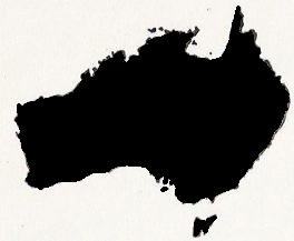
Fig. 5. — Australia, drawn on an equal-area projection We have expert testimony to the fact that the
best maps are not too mathematical. Moreover, a map is in a sense a portrait
of one's father- land, something with features that can be remembered with
pleasure, and a form that can be identified with pride. Now a portrait of
one's parent might conceivably be done on an elastic canvas, and twisted
out of shape and stretched between parallel boundaries in such a geometrical
way as to preserve a perfectly correct area of nose and mouth and white cravat,
and yet be hardly recognisable. If such an equal-area portrait of one's.
father were to be rccognised, it would be painful, and if it were not recognisable,
it would be useless. And so of one's fatherland.
There are other circular projections of the world in which the central portion is true as to form and area, but which, towards the periphery, become exaggerated and violently distorted. Such maps are good enough for one ocean, or even a whole continent — such, for example, as North and South America; but then the rest of the globe is either cut in two, or so inadequate, that an extra map with its frame of co-ordinates fitted over Asia this time is necessary, and then it is America that is sacrificed. This type of map with a focal area is, in a word, only good for half the world at a time. This foregoing brief review of the faults of Mercator's projection, and the distortions of the lesser-known equal area and other projections of the whole world, will serve to bring to a point what is really wanted in a world map and what can be reasonably expected. Every map of the world must be a compromise, and in every map something must be sacrificed in order to lay a spherical superficies on a flat plane. Now, the great need of the age, in this respect, is a map, not for navigators, but for geographers and scientists in general, to display |
|
AN ACCOUNT OF A NEW LAND MAP OF THE WORLD 455
the world "from China to Peru," so that all lands
are shown on the same scale without rupture or distortion. A map of this
character is badly needed for purposes of comparison by the geographer, teacher,
the political economist, the statistician, the statesman and the student
of "Weltpolitik." The scientist needs such a map badly — in fact, an accurate
picture of the land of the globe is indispensable to the geologist, the biologist,
the ethnographer, and the palæontologist. In short, the uses of such
a map are endless. And yet for all these purposes, the world is still shown
on Mercator's preposterous chart, originally invented for the use of seamen. In Mercator's time, the world was little known as we know it and until recently it was still generally unknown. Now it is not only generally surveyed but the land is allotted, and most of the titles confirmed and more likely to be permanent than at any time since the Roman Empire. Mercator's map was invented and used to explore the seas in a strictly literal sense. We need a map now to exploit the land in endless ways. If, on Mercator's chart, the facts about the land were sacrificed to make a practical guide across the waters, in a new map it may become necessary sacrifice the water in order, more accurately, to delineate the land. As we know, the globe is mostly water. If we ignore the water and are prepared to sacrifice it wherever the demands of the land are paramount, we have made the first practical step towards an accurate land map of the globe. If the land and water are as 5 : 2, we have already disposed of five-sevenths of the problem. We shall map the land of the globe exclusively without any attempt to map the oceans, except as they cling to the contours of the continents as we develop them, or as the oceans shall take their place in any scheme based primarily on the needs of the land. Having resolved to make a land map and not a sea chart, let us take up the problem step by step. If I approach a terrestrial globe and throw a napkin of the proper size over it with one corner tucked under, I can cover up entirely the "three corners of the world," as Shakespeare puts it, as they hang over the North Pole. If I now take a pair of scissors, and make a few cuts here and there corresponding to the general outlines of the earth — cutting away the ocean, in other words, which we have determined not to bother with; and if I now pick this napkin off the globe — still keeping the odd corner tucked under — and I fling it on a table, I shall have a land map of the world pretty well blocked out already. The corners on each side of the one tucked under will make the long side of a straggling triangle — these will be South America and Australia. The short extension opposite the comer tucked under will be the continent of Africa. In this experiment we come to realise that the land of the world can be displayed by looking dowm at the Pole instead of sideways at the Equator. On this general basis, I made my first, map, which I traced on tissue |
| 456 SCOTTISH GEOGRAPHICAL MAGAZINE paper from a globe. I did
not show lines of latitude nor longitude, although I showed a spinal or central
meridian through Africa (20°), Asia (105°) and the Americas (70°).
Three short isolated lines at right angles indicated the Equator. New Zealand
was included in the Australian group. This was my land map, arbitrary and
unscientific — a sprawling, naked effigy of the world, unclothed with co-ordinates,
uncradled with encompassing oceans. I had some dozen skeleton copies struck
off by sun process, and proceeded to fill these out to illustrate my thesis.
For even with all its faults, this was actually a far more accurate map of
the land of the whole world than I had ever seen before, and it served my
purpose admirably.
Then came the great earthquake and fire of San Francisco (April 18, 1906), and my maps and diagrams were all burned along with every- thing else I possessed, both in my office and in my home. Within a year I was back at the problem, which I approached this time in a more scientific spirit. I determined to plot out the lines of latitude and longitude on such a system that the land of the world would fit into this frame of co-ordinates with the minimum of distortion and exaggeration, and without disruption of the land masses. To this end, the whole was to be viewed from the North Pole down to 25° N. Lat., on the plane of the Equator or parallel thereto, and with the three continental extensions and the fourth oceanic one jutting out from the circumpolar disc like the leaves of a quatrefoil. This proved a much more tiresome and difficult task than I imagined. However, out of all the experiments and essays at a solution, certain fixed and fundamental conditions survived which seemed final and inevitable. One of these was that the axial meridian of Africa about 20° East, was the correct starting point; also that the 360 meridians should be divided into four groups of 90° each. Another one was that the world should and must be seen in its entirety, both land and water, down to 25° N. Lat., and that the goring of the Southern oceans should take place on about the 65th deg. East, and the 25th deg. West, and so on around the globe, at intervals of 90° if possible. This arrangement included both India and Australia in one 90° section, and South America in another. Unfortunately, as I thought then, New Zealand had to be separated from Australia and left to lord it alone, supreme among the islands of Polynesia. But as the New Zealanders themselves much prefer it this way, this feature of the map need hardly call for our regret. In projecting the circumpolar world down to 25° N. Lat., it soon became evident that the attempt to crowd the spherical area of an inverted bowl on to a disc no bigger than the periphery of its rim, was a feat involving grave error. To spread the bowl out involved error in the opposite direction. To include the bowl's actual surface all on a circle somewhat between the two was a scientific solution, but one involving serious distortion. Figure 6 shows the actual globular area as seen on the gores of a globe starting from the Pole and extending to 25° N. Lat. — that is, subtending a total angle of over 2 (90-25) or 130 degrees of arc. |
|
AN ACCOUNT OF A NEW LAND MAP OF THE WORLD 457
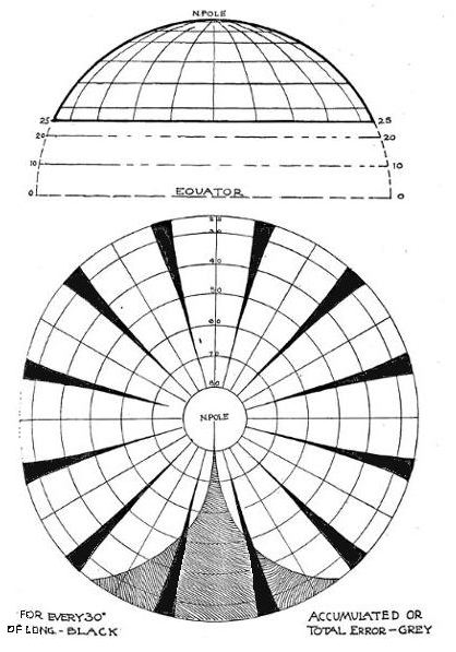
Fig.. 6. — For explanation see text
|
| 458 SCOTTISH GEOGRAPHICAL MAGAZINE As we recede from the Pole where eyerything is correct,
the error increases, the black intervening spaces indicating graphically
the exact proportion of error. The shaded portion of the disc shows. these
spears of error gathered into one sheath, as it were — the total error.
And one can see that it is excessive. Now, if we imagine the gores to be
elastic, and we constrict the outermost ring of longitude (25° N. Lat.)
until we have squeezed in and therefore widened out their ends, we haye
achieved pictorially what is, when this feat is done mathematically, known
as an equal-area projection. In other words, as we go south from the Pole
and each parallel of latitude gets too wide in its periphery for the truth,
we make compensation by shortenIng each degree or group of dcgrees of latitude
also as we go south. In this way, the process that adds to the truth of area still further aggravates the error of distortion.
It is exactly as if one took a familiar portrait four inches wide and six
inches high on some elastic fabric and first distorted it by stretching it
sideways an inch, Which is pretty bad, and then squeezed it down nearly another
inch — which is worse. The portrait, after this treatment, may not be recognisable,
however its total area and the area of all its parts, its light, shade, and
colour remain the same. While this method might be scientific, the need for distortion was repellent: and, once started, the need increased on reaching other regions of the map. And so, disgusted with my futile efforts, I concluded to throw ovcrboard the condition of the land continuity and determined to show no more than 80 degrees of arc in one circle, instead of 130 degrees. This meant that the polar projection was to go no further south than 50° N. Lat. This involved splitting the Asiatic contincnt on the 65th meridian — amputating the armpit of the world, as it were; and it also meant the extension of the great peninsulas on axial meridians that did not cross the Pole at right angles. In other words, to secure truth and accuracy, I gave up trying to do what seemed impossible. At this stage in my progress, somewhat baffled and disappointed, I ordered a professional map-maker to draw me a scheme of co-ordinates with a view to putting an end to my own apparent waste of time, and to allow me to get to my original problem, of which the map was, after all, merely an episode. Another long period intervened well taken up with pressing husiness, and finally in the spring of 1908; I again approached the problem with a fresh and open mind, reinforced with the experience and familiarity with the subject that I had so laboriously accunmlated. Grcatly dissatisfied with the map as it stood, I began to go over the whole subject once more, da capo. It seemed extremely illogical, for instance, to let the centre of my map get the best treatment, for it was this 80 degrees of circumpolar integrity that was at once most accurate and without hreak. Now it will he seen that fully 50 degrees of the top of the earth comprises the Arctic Zone: the uninhabited, untraversed, icebound polar sea. Why waste the truest portion of our projected map in visualising the least important part of the world, especially when we have deliberately determined to make the regions of greatest accuracy of |
|
AN ACCOUNT OF A NEW LAND MAP OF THE WORLD 459
projection correspond with those regions of the
world where man's activity is most concentrated? This region is ohviously
the North Temperate Zone. In brief, our accuracy must not be concentrated
any more on the Pole than on the Equator. In other words, it was wrong to
look at the world "cylindrically" — from the, Equator, and equally wrong
to look at it radially from the Pole. Why not take a middle course, neither
hot nor cold, and make the principal view point neither horizontal nor vertical,
but oblique;
neither a cylinder around nor a disc atop, but a cone lying athwart and touching
the centre of the very belt we are most interested in portraying accurately.
|
|
|
Fig.
7. — For explanation, see text. Note that the complete circle should be drawn
at 45° as corrected, and not at 40° as shown. This circle is the earth's
circumference.
|
|
Figure 7 is an arrangement of the gores from a
globe so that they touch at the 45th degree of North Latitude. This shows
at once that the land masses of the world from 25° North to about 20°
from the Pole — that part, in other words, which must remain coterminous
East and West — can best be joined by making the gores of a glohe touch
each other, not at their centres (Figure 2, Mercator's) nor at their ends,
as in Figure 6, but midway between — in the middle of the land belt of the
world, viz. at 45° N. Lat.
|
| 460 SCOTTISH GEOGRAPHICAL MAGAZINE Let us now turn from the mechanical consideration
of the thirty degree gores of a globe (and they have proved very helpful
in making clear our progress) and consider the problem geometrically.
Figure
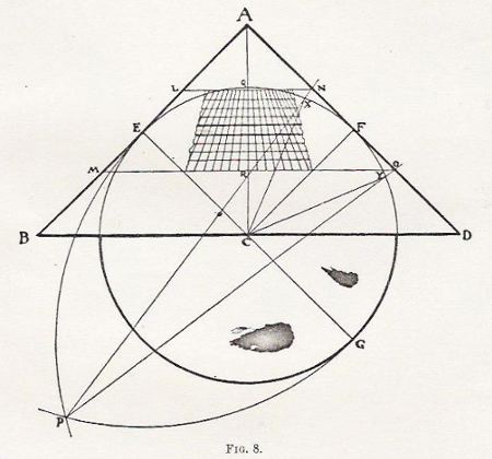
8, which represents a solid both in section and elevation, but not in perspective,
shows a right-angled cone, ABD, tangent to a sphere EGF at E and F; E and
F being equivalent to 45° North Latitude. If this cone be slit up from
any point in its base in a straight line to its apex, it can be developed
or laid out flat into exactly two-thirds of a disc BBCDD (Figure 9, which
is a "plan"). In the cone BA and DA coincide — they are, in fact, one and
the same line. In the developed or flattened disc BA and DA gape or widen
out to the angle BAD, which is one-third of a circle, viz. 120° of an
arc.
If we complete the circle we shall have (1) four parts each subtending 60°, which when curled into a right-angled cone are tangent to the sphere EGF, and (2) also something over, that is, exactly two more such parts of 60° each. Now assuming the sphere to be a terrestrial globe with polar axis AC, we can project the parallels of latitude on to this cone. We propose to project a belt 45° wide, or 22 1/2° N. and S. of 45° North Latitude. This will give us 22 1/2° North Latitude, and 67 1/2° North Latitude as the boundaries of our zone of conical projection. |
|
AN ACCOUNT OF A NEW LAND MAP OF THE WORLD 461
On Figure 8 the arc QF is bisected at X, and the
arc FY is equal to the arc FX. XFY is an arc of 45°, and may be projected
with approximate accuracy on to the cone AD, at the points N and 0 from P
(which is found by intersecting reciprocal arcs from GE and EG).
On the Frustum LMON we can now divide off latitude and longitude to suit. For convenience we draw them on the Frustum as it is displayed in the festoon MMROOLLQNN (Figure 9). Ten concentric lines give parallels of latitude every 5°, or 22 1/2 +5; 22 1/2 +10 . . . 22 1/2 +45, or 671/2. The tangent parallel 45° is not shown, but is midway between the thickened latitudes (42 1/2° and 47 1/2° N.). 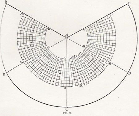
It will be seen that in this projection of co-ordinates
we have a scheme which only attempts the rectification of 45 degrees of arc.
The belt, festoon, or horseshoe here indicated is therefore exactly of the
same degree of accuracy as Mercator's chart between 22 1/2° North and
South of the Equator, with the advantage that it covers the most important
instead of the less important parallels.
The Equator, however, is a great circle, and takes in (together with its 45° belt) the full circumference of the earth. |
| 462 SCOTTISH GEOGRAPHICAL MAGAZINE Now, curiously enough, the small circles of 45°
North and South when displayed on an enveloping and tangent right-angled
cone have the radius of a great circle with two-thirds of its circumference.
Because in Figure 8 (supra) AF is equal to EC, the radius of the globe,
therefore the 45th parallel on the plan or displayed cone is two-thirds the
circum- ference of the sphere to which it is tangent. Therefore it is two-thirds
the Equator. But in this projection the 45°-wide belt of the same accuracy
as Mercator's equatorial belt of 45° is repeated in the southern hemisphere
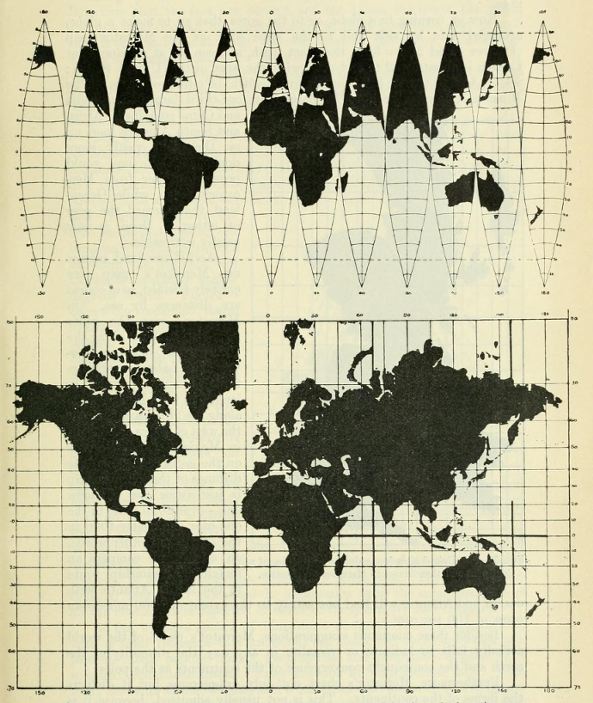
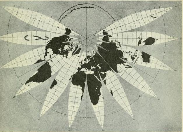
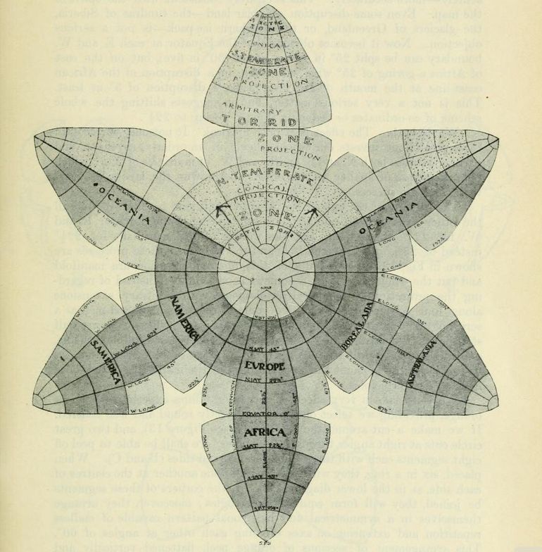
in four separate parts. In addition to these belts, tangent to 45° North and South, there are four similar belts tangent to the four meridians upon which N. and S. extensions are deyeloped. From 22 1/2° above and 22 1/2° below the Equator these are equivalent to four squares 45° each way, or added together they make a band 45 degrees wide and tangent to the earth, 4 × 15°. or 180 degrees of arc. (The tangency is, however, longitudinal, not equatorial.) The equation therefore stands thus:— The conical projection contains 2 × 2/3 of a great circle, plus 180°, or half a great circle = 1 1/3 + 1/2, or 1 5/6.. The cylindrical has but one great circle of this character. That is to say, the map under discussion has an area of maximum accuracy five-sixths larger than Mercator's map — the kind and quality of accuracy under comparison being identical. But the one area covers the tropic zone, and the other is identical with the N. and S. temperate zones. Moreover, Mercator's accurate zone is mostly sea and forest and unexplored islands, whereas the other zone includes the whole civilised world, and such important white man's countries south of the line as Argentina, the Cape, Australia, and New Zealand. Another way of putting it is to state that exactly 50 per cent. of Mercator's equatorial accuracy (45° wide) is included in the new map, the 50 per cent. in question being divided into four parts of 45° each, three of which are land areas-the only land areas on the Equator. This is in addition to the temperate zones aforementioned. Figure 10 shows a world map completed on these principles. However, the equatorial region of non-conical projection extends to 25° North and South, and the tangential or conically-projected portion extends thence to 80° North latitude. This map has a simplicity of form that may commend it — but there remains one step further toward still greater accuracy, system, and uniformity, than is here contained. In this map the portion keyed to include Alaska serves as an admirable reminder that these upper boundaries are to be connected in one's mind. Here also we see the advantage of the redundant sections — the spare room where we can repeat a continent to show ocean boundaries, a device advantageously enjoyed by Mercator's map and this one jointly. This is a device for which also there is precedent and a mental habit formed by all those who see and use Mercator's map. One can conceive a map with the lobe and a half carrying the New World arranged on a pivot which can be swung around and keyed into |
|
AN ACCOUNT OF A NEW LAND MAP OF THE WORLD 463
the two and a half lobes of the Old World — thus
having a very symmetrical four-lobed map instead of three lobes and two half
lobes. (See Figure 11.) Again, the Oceanic or split lobe could be divided into a serrated edge corresponding to the international time boundary — each full lobe representing six hours of time. Or the entire circuit can be printed with necessary "repeats," but the world once round could be coloured and the repeats plain. Or again, the world could be printed with repeats coloured and lettered in full, and a pivoted mask could be attached to block out one third of the entire circuit and so show no more than the whole world at one time. |
|
|
Fig.
10. — Scheme No. 3, 5° intervals. Conic projection tangent to 45° N. an S.
from 25° N. and S. to 80° N. and S. From 25° N. to 25° S. the projection
is arbitrary and accomodating.
|
| 464 SCOTTISH GEOGRAPHICAL MAGAZINE Another variation for American use would be to
repeat the New Zealand and Asiatic lobe and a half with the American meridian
central and vertical. Australians could print their maps from another angle
and New Zealanders from still another.
This map was no sooner finished than I realised how it could be very materially improved — made entirely logical and mathematical as well as practical, and like philosophies, religions and goveruments, made to suit the world as the world actually is. This has been the object throughout: not to impose an artificial scheme of co-ordinates on the globe, as though the world were nothing but lines of latitude and longitude — a system which might do very well on some other planet than ours. |
|
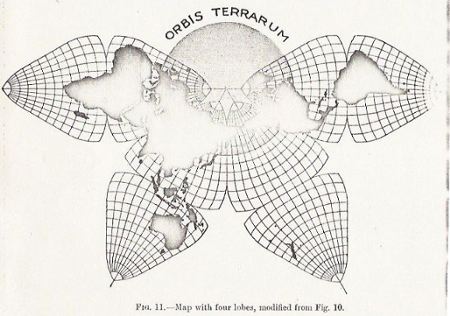
Fig. 11 — Map with four lobes, modified from Fig. 10. |
Notes by GK: The defects of the map shown in Figure 10 are not serious, and it is possible that the next refinement, may overstep the mark, and while being more accurate, more logical, and more scientific, may lack the simplicity that makes for popularity. The weakest points in this map are in the regions of the Equator as it recedes E and W. from the four axial meridians. The lines of longitude, 65° E. and 25° W., should be no longer from Pole to Pole than the central one, 20° E., which runs through the centre of Africa. This error is all the more marked for being concentrated in the central curved portion of the meridians. A glance at the Asiatic division (where the network of co-ordinates is visible throughout) shows us that the outer- |
|
AN ACCOUNT OF A NEW LAND MAP OF THE WORLD 465
most rectangle is about one and three-quarter
times what it is at the Equator — an error of 75 per cent. Fortunately there
is not much land at these margins, the African division being. particularly
free. But the island of Guinea is visibly affected, and the NE. corner of
Australia is somewhat drawn up, and in the same way Brazil, New Guinea, and
India are all somewhat askew. Seeing that the Equator is free from land towards
the edges of each lobe, why can it .not be gored or split in two as certain
meridians have already been treated?
|
|
|
Fig. 12 — For explanation see text. The shaded areas show the portions that
are of the same degree of accuracy as Mercator's Equatorial Zone, from 22
1/2° N. to 22 1/2° S. lat. The circle marked by the arrows shows the exact sie of the globe to scale.
|
| 466 SCOTTISH GEOGRAPHICAL MAGAZINE
Furthermore, the Arctic coast-line is somewhat expanded owing to the spread
of meridians at 80; these meridians might be gored also 10 or 15° below 80
and gathered into sheaths, converging to the Poles more acutely — more accurately.
This is entirely consistent with the spirit of the map. Even some disruption
of polar land — the tundras of Siberia, the glaciers of Greenland, or the southern
ice-pack — is not a serious objection. Now it becomes obvious that the Equator
at each E. and W. boundary can be split 25° in seven places (30° in five),
but on the east of Africa a goring of 25° wide will result in a disruption
of the African coast-line at the mouth of the river Juba, a disruption of
3° at least. This is not a very serious matter, but it suggests shifting
the whole scheme of co-ordinates or reducing the 25° goring to 22 1/2°.
We do both. The effect is at once magical. It not only corrects all these errors, but invests our whole scheme in an orderly, rhythmic, and harmonic series, both N. and S. and E. and W., of multiples of 22 1/2° which puts the stamp of finality on our efforts and crowns the labour of years with complete success. The shifting of the axis of the African continent to 22 1/2° W. and all the other axes correspondingly; also the goring of the Equator E. and W. for 22 1/2° throughout, and the goring of the meridians for 22 12° instead of 25°, both from the Pole and the Equator — these processes are shown in Fig. 12. The results of this final modification are manifold and put the whole scheme in a somewhat new light. Instead of regarding the projection as a conical development with arbitrary extensions along four selected meridians, we come to regard the general map as a series of eight equilateral triangular planes or plates, whose sides are half straight in the centres, and curved at the corners — a testudinal scheme, one might almost call it. To get a better grasp of its construction, let us forget for the moment the conical origin of the map and go back once more to first principles. We can make a very effective and enlightening experiment with an orange, providing we select one that is perfectly round and well centred. If we make a cut around the "horizon" (see Figure 13), and two great circle cuts at right angles through the "poles," we shall bc able to peel off eight segments each with three equilateral curved sides (B and C). When placed, six in a ring, they will be tangent to one another at the centres of each side, as in the lower diagram (D). If the corners of these segments be joined, they will form equilateral triangles; moreover, they arrange themselves in a symmetrical and hexagonal pattcrn capable of endless repetition and extension on axes crossing each other at angles of 60°. This arrangement of sections of orange peel, flattened vertically and pressed together laterally so that the middle half of each boundary is straightened, will serve to suggest in a homely but graphic way the manner of making the map shown in Figures 11, 12 and 14. Each section has its mid area 90° wide and 45° high, with its straight radial meridians and concentric circular parallels. This area is of a conical continuous projection, and is practically coincident with the temperate zones (22 1/2°) instead of 23 1/2°, and 67 1/2° instead of 66 1/2°). Each section has its 22 1/2° × 45° mid area on its base which, when joined to |
|
AN ACCOUNT OF A NEW LAND MAP OF THE WORLD 467
its southern mate,
gives an equatorial area 45° × 45° on either side of
a straight axial meridian. Then each section has its three corners isolated
and arbitrary, but of very moderate error both of area and shape.
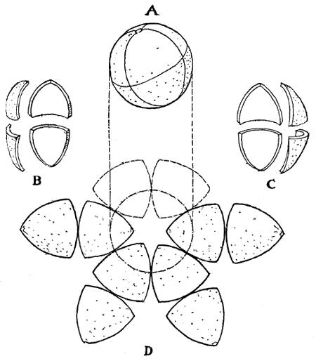
Fig. 13.-Experiment with an orange.
By dividing each quadrant of 90° into four
parts at intervals of 22 1/2°, which harmonically coincide not only
with the axes and boundaries of each section but with the zones of temperature,
the type of projection
|
|
468 SCOTTISH GEOGRAPHICAL MAGAZINE
and the quartering of each quadrant of latitude and longitude are the same
from the zero of Greenwich to the zero of the Equator respectively — an arrangement
which seems irresistibly logical and convincing. If each group of 22 1/2° be
divided into three, we have co-ordinates every 7 1/2°, which include the 15°,
30°, 45° . . . series shown on most globes. If a 5, 10, 15, 20 .
. . series be preferred, then the axial and boundary meridians (2 1/2 plus) will be omitted,
and the ocean edge where gored will show as a mere edge of colour.
|
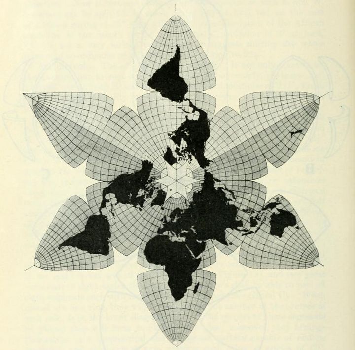
Fig. 14 — The completed map. For explanation see text. |
| 468 SCOTTISH GEOGRAPHICAL MAGAZINE These
are details for professional map-makers. So also are the nice accommodations
in plotting co-ordinates so as to equalise errors in many subtle ways of
too complicated a nature to be gone into thoroughly here. It might be pointed
out that a map made on the projection of
|
|
AN ACCOUNT OF A NEW LAND MAP OF THE WORLD 469
Figures 11, 12 and 14, or with any of the variations to suit any of the nations
of the earth, carefully printed on both sides with silk or cotton stiffening
and hinge, and cut clean to the margins, could .be made to fold in a leather
case. By turning over the outermost sections, the South Polar regions could
be brought into the same continuous relation that the North Polar regions
have in Figure 11. A double map could be physical on the obverse and political
on the reverse, or bilingual, etc., etc.
In conclusion, I will point out that while we have not professed to care for the oceans, this map shows the most important sea routes commercially in absolute integrity — sea routes that certainly aggregate 90 per cent. of the total tonnage of the world in annual transit. Finally, it is possible on every map printed on this projection to show the earth's exact relative globular dimension, by completing the circle of the 45th parallel either in the centre of the scheme or at the extremity of one of its lobes. SAN FRANCISCO, Feb. 1909. |
|
Appendix by Gene Keyes: As mentioned, I had previously recompiled
a bad 1973 Xerox copy of the original Butterfly World Map, Fig. 11, p. 464.
For the record, this is what that Xerox looked like:
I posted this composite remake in 2007, but was not satisfied with it: 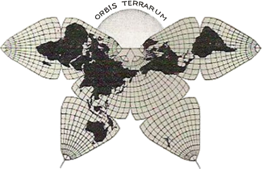
Then for the 2011 reprint, I made and used a different composite scan, with whiter originals, and an unfilled arc, as Cahill himself drew them soon after his initial article. (For some reason, his arc in this one is at 40° N. rather than 45° as in the original.) 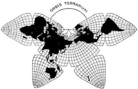
But
with the appearance of The Internet Archive's recent posting of the original,
I was able to replace these improvisations.
|